Text Formatting
Another thing to consider when designing websites and writing documents is how you format your text.
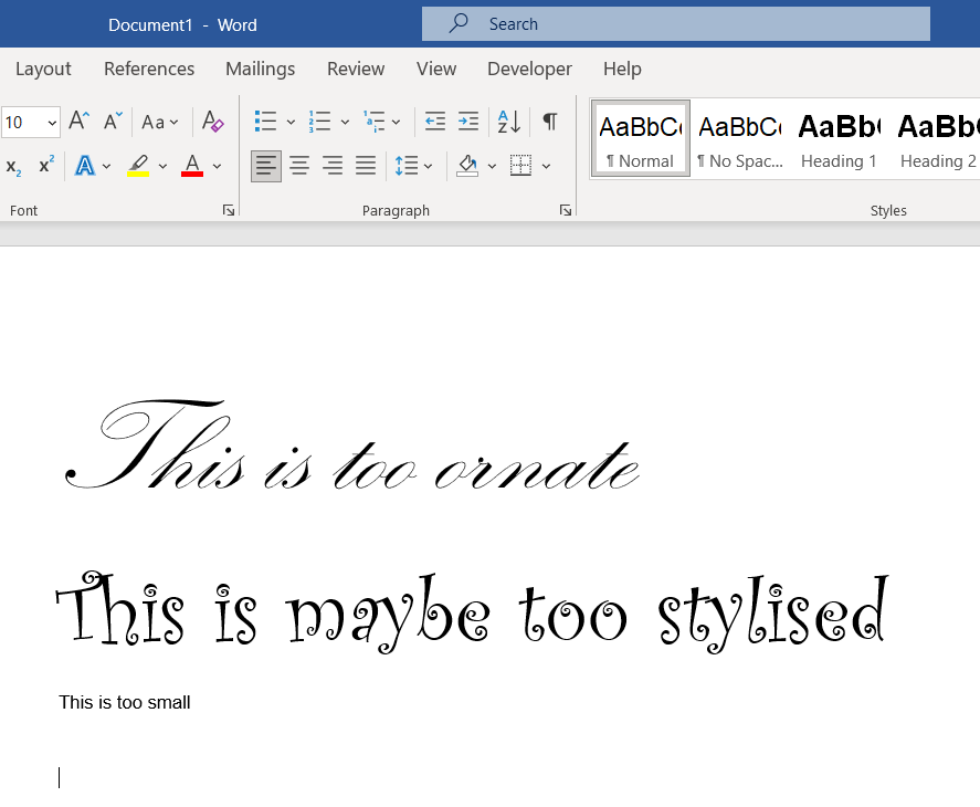
Very ornate or stylised fonts can be difficult to read as can text which is too small. See the examples below.
The current guidelines recommend that text in digital documents and websites have simple san-serif fonts. San-serif means ‘without serif”. A serif is a small line or stroke regularly attached to the end of a larger stroke in a letter or symbol. An example of a popular serif font is:
Times New Roman
You can see the little extensions (serifs) added to the end of the lines that make up the letter. These can make the letters more difficult to read especially if the text is small.
An example of a popular san-serif font is:
Arial
Arial has a very simple design which is deemed to be easy to read even at small sizes. This training is written in Arial
The full list of text formatting recommendations for accessible digital text is listed below
Websites
San-serif font such as Arial. Size 16
Documents
Normal Style for non-heading text – Size 14 Regular, Sans serif fonts such as Arial, Avenir and Calibri
Heading 1 – Size 18 Bold, 3 points before, 12 points after, Sans serif fonts such as Arial, Avenir and Calibri
Heading 2 – Size 16 Bold, 3 points before, 12 points after, Sans serif fonts such as Arial, Avenir and Calibri
Heading 3 – Size 14 Bold, 3 points before, 12 points after, Sans serif fonts such as Arial, Avenir and Calibri
Header and Footer – Size 12 Regular, Sans serif fonts such as Arial, Avenir and Calibri
Paragraphs should be left aligned with a space between each paragraph.