Contrast
Contrast level
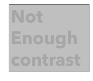
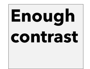
The term ‘contrast level’ refers to the difference in brightness between two objects on a screen. In Graphic 1 below we can see that there is very little contrast between the text and the background colour. This would make it more difficult for someone with a visual impairment to read. Graphic 2 has much more contrast between the text and background and would therefore be much easier to read if your vision is poor.


The WCAG regulations (discussed later) state that there should be a contrast ratio of at least 4.5 to 1 between your onscreen elements and their backgrounds. If you apply this criteria to the objects above it means that the text should be 4.5 times darker than its background for it to be effectively visible.
If you are wondering how you would measure contrast in your own graphics there are a number of online resources such as contrastchecker.com. On this website you can upload the colour values in your graphics or the actual graphics themselves and have their contrast levels analysed. According to contrastchecker.com the contrast level between the objects in Graphic 1 is 2 to 1 and the contrast level between the objects in Graphic 2 is 18 to 1
Important note here….To discuss the issue of contrast above I used two graphics made up of coloured squares with text on them. Due to them being graphics the text on them would not be readable by a screen reader. With this in mind guidelines suggest that you either try to avoid using graphics with text in them or ensure that you use alt-text clearly explaining what the graphic and its text is. For graphic 1 the alt-text is ‘A mid-grey box with the text ‘Not Enough Contrast’ in it. The text is in letters which are only slightly darker than the background making them difficult to read’.